Case study 01 · Fintech UX · Accessibility
roomie
receipts
Splitting shared bills without the awkward conversation.
The
problem
Living with roommates meant constant small shared costs: grocery runs, furniture for the house, trips together. Keeping track of who paid for what was harder than it should be, and asking a roommate to pay me back felt even more awkward.
Existing tools like Splitwise required everyone to download an app and create an account. For a quick grocery split, that setup felt like more effort than the problem deserved.
Goal
Split a bill and share it with roommates in under a minute. No app download, no sign-up.
v1: What I shipped
Used by my roommates and friends
for groceries, furniture and trips.
- No login
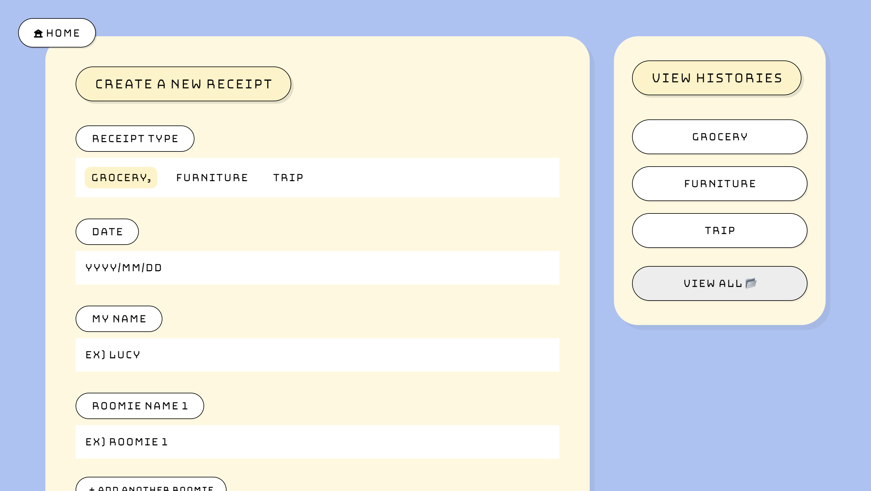
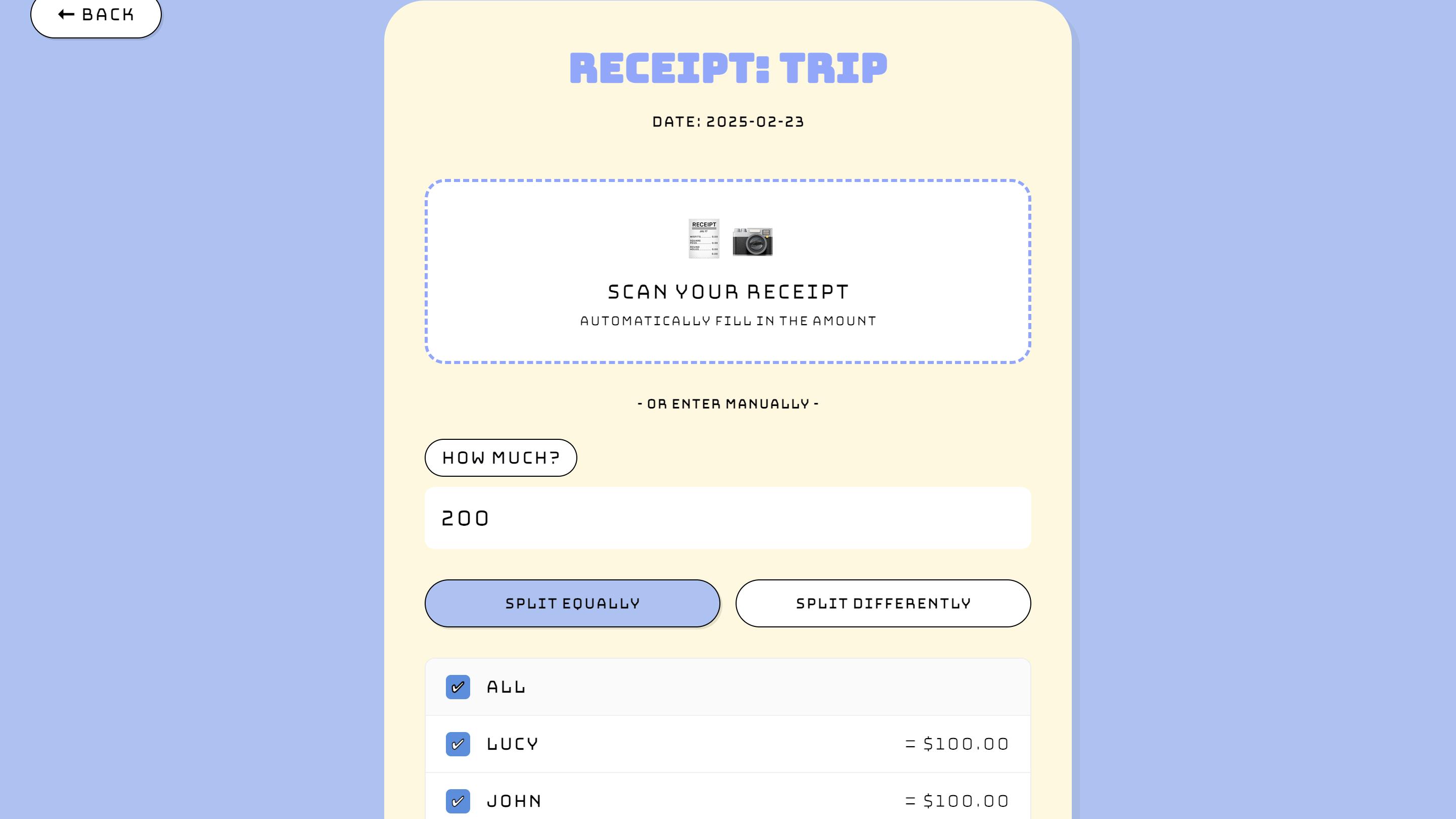
- Create a receipt, add names, and get a share link immediately.
- Two split modes
- Split equally, or enter custom amounts. With two people, one amount fills the other.
- Share flow
- Copy the link, or a ready-made friendly reminder for the group chat.
- Retro style
- Bungee type and bold outlines to make money talk feel lighter.
Auditing v1,
one year later
After learning WCAG in class, I reviewed v1's code and design with fresh eyes. It worked for my friends, but not for everyone.
-
Accessibility
- Body text in an ultra-thin, all-caps display face
- Contrast as low as 1.8:1 (AA needs 4.5:1)
- Inputs with placeholders but no labels
- Checkboxes and history items unreachable by keyboard
- Errors only as browser alert() pop-ups
-
Money accuracy
- $10.00 split three ways gave $3.33 each: one cent vanished
- Custom splits could save without adding up
- Totals were never saved: a missing column, and the error was ignored
-
Privacy & trust
- The README promised local-only privacy; receipts actually lived in Supabase
- Row Level Security was off, so the public key could read every row
- Advertised receipt scanning and PDF export that didn't exist
-
Device support
- Designed and tested only on laptops
- Only the landing page adapted to small screens, though people split bills on their phones
Four decisions
each keeps v1's personality
while fixing what the audit found
-
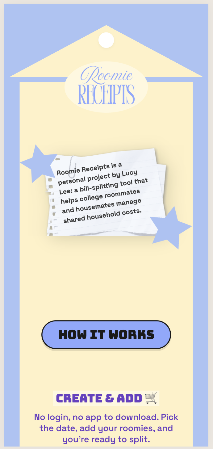
Keep the fun, fix the legibility
- Options
- Drop the retro style · keep it everywhere · display text only
- Shipped
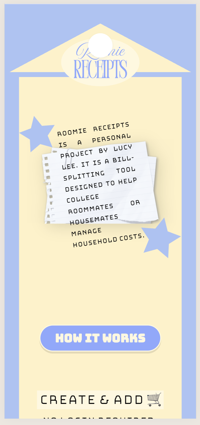
- Bungee only for headings and buttons; Space Grotesk for body, inputs and amounts; no text-stroke.
- Why
- Every text colour now passes 4.5:1. The receipt title went from 2.1:1 to 5.9:1.
-
Make every cent visible
- Options
- Round silently · give the cent at random · show it and let people choose
- Shipped
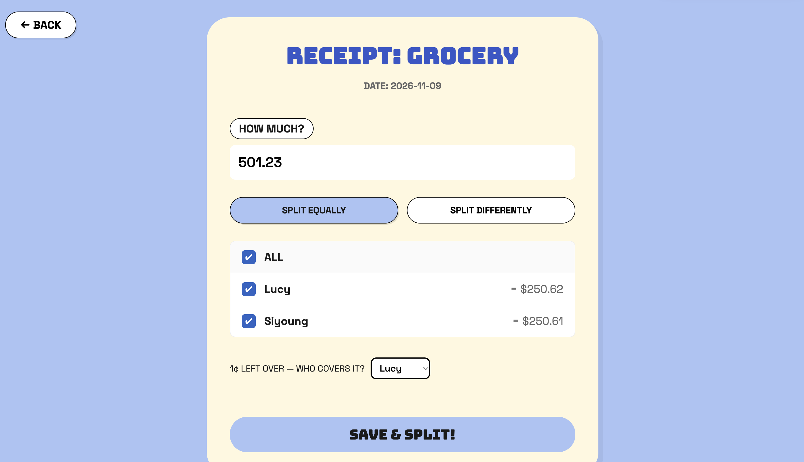
- Integer-cent math. “1¢ left over: who covers it?” with a dropdown, and a live “left to assign” counter.
- Why
- In money UX, trust comes from totals that always add up. The server re-checks the sum too.
-
Be honest about where data lives
- Options
- Add accounts · secure the database · store everything locally
- Shipped
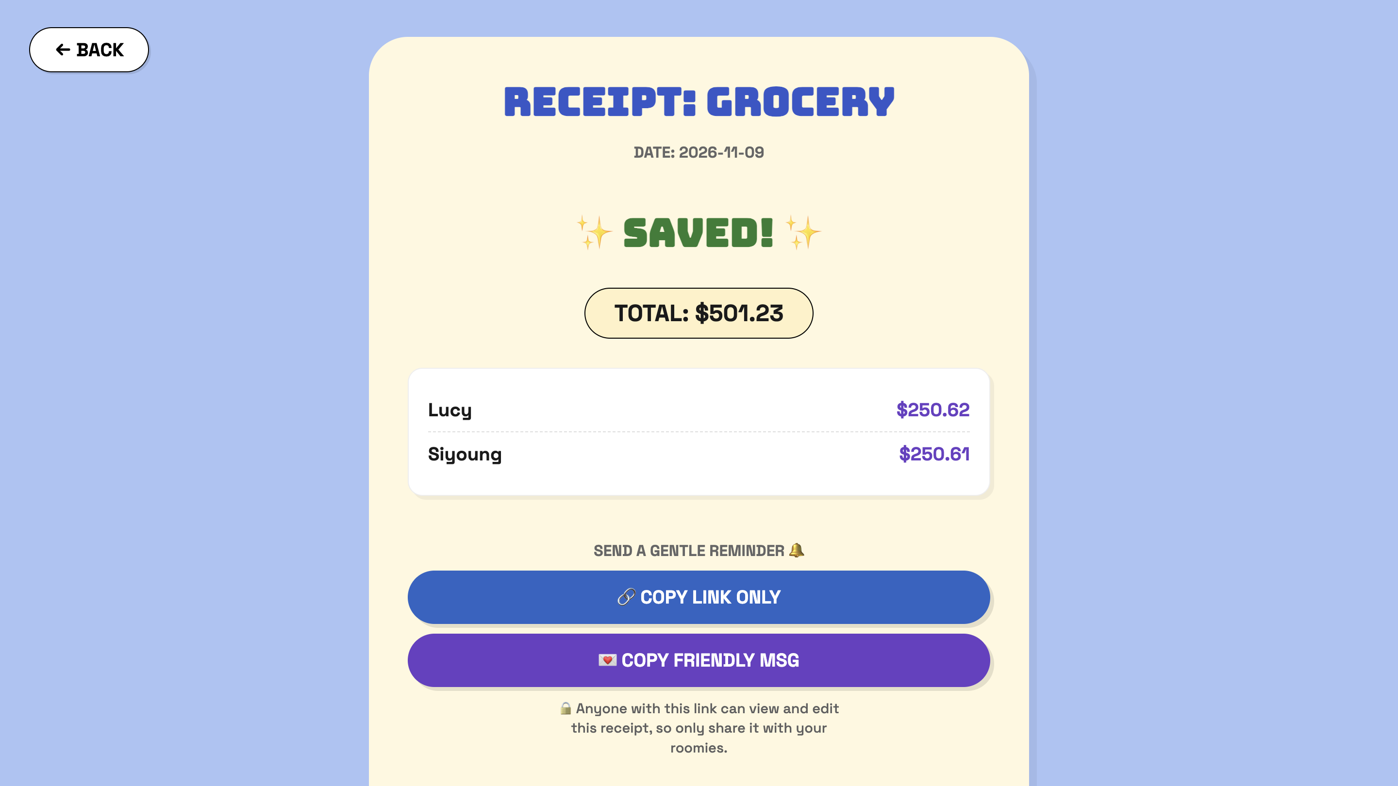
- “The link is the key”: three single-receipt Postgres functions, RLS on, and a plain privacy note.
- Why
- No-login was the core value, so the fix belongs in the system and the copy, not in more friction.
-
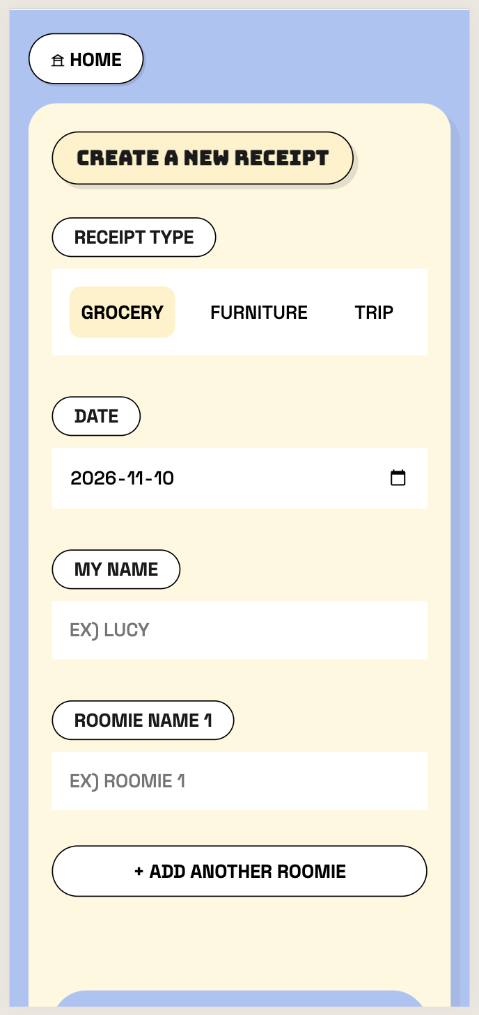
Make it work on phones
- Options
- Shrink the desktop layout · build a separate app · responsive layouts
- Shipped
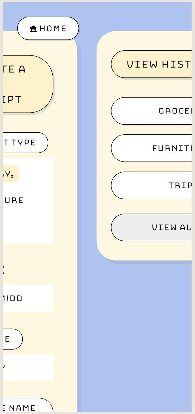
- Below 768px: stacked sections, full-width buttons, 44px tap targets, 16px inputs, number keypads.
- Why
- Splitting usually happens right after paying, phone in hand.
Outcome
v2 shipped Nov 9, 2026,
live at the same link.
| Screen | v1 | v2 |
|---|---|---|
| Landing | 88 | 100 |
| Create receipt | 96 | 100 |
| History | 96 | 100 |
The scores understate the change. Automated checks can't tell that v1's checkboxes were unreachable by keyboard, that its hairline text was hard to read, or that its numbers didn't add up. Those were found by reading the code and testing by hand.